Complementary colours, after-images, retinal fatigue, colour mixing and contrast sensitivity.
Retinal fatigue causes complementary colours to be seen in after-images. This page has six animations that produce after-images (optical illusions) in complementary colours, using the additive and subtractive primaries as stimuli. It also has demonstrations of both additive and subtractive colour mixing, and of contrast sensitivity and lateral inhibition. This page supports the multimedia tutorial The eye and colour vision, from which you may download these animations. For best effect, set your screen to maximum brightness.
|
|
|
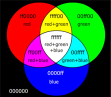
The hexadecimal numbers show the proportions of each colour. See colour mixing for details
|
Red stimulus with cyan after-image
So why does it work? The photoreceptors in your retina that respond to colour come in just three varieties, which we call 'red', 'green' and 'blue' according to the colour which produces maximal response. Provided that you fixate on the red rectangle, a rectangular patch of your retina is illuminated with (only) red light, while the surrounding retina receives a mix of red+green+blue light from the three available colours in the screen. In that patch, the 'red' photoreceptor cells gradually become fatigued, while the 'green' and 'blue' cells are rested. After 30 s, the screen goes white, so now the patch with the fatigued 'red' cells is illuminated equally by red, green and blue light. The 'green' and 'blue' photoreceptors responde strongly, but the 'red' cells only weakly, so we see predominantly a mix of green and blue, i.e. cyan. The red signal is not zero, of course, so the cyan we see in the after-image is somewhat paler than the cyan shown after 10 s. Cyan is the complementary colour of red, meaning that cyan plus red = white (for human eyes, at least). See The eye and colour vision and Color Mixing for more explanation. |
Cyan stimulus with red after-image
Now let's
fatigue the 'green' and 'blue' photoreceptors by presenting a cyan image.
The after-image you see will not be as strong as the pure red displayed after the experiment, because your 'green' and 'blue' cells, though fatigued, will still respond.
|
Blue stimulus with yellow after-image
|
Yellow stimulus with blue after-image
Green stimulus with magenta after-image
|
Magenta stimulus with green after-image
|
| |
If you look at the diagrams at the right, you can see that colour mixing on a RGB monitor is just arithmetic addition – with the slight complication that it's in hexadecimal. We see that
red + green = ff0000 + 00ff00 = ffff00 = yellow.
You'll also see above that
magenta + green = ff00ff + 00ff00 = ffffff = white.
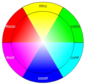
Colours that add to give white (or at least grey) are called complementary colours. In the lower diagram, we show three complementary pairs at right: complementary colours lie opposite each other: the complementary of red is the colour of cyan (which is made from the other two additive primaries, blue+green). The complementary or blue is yellow (= red+green), and the complementary of green is magenta (= red+blue). (RGB are the additive primaries, while CYM are the subtractive primaries. See Colour Mixing for more detail.)
In the second diagram, the inner sectors show how the complementary colours are progressively added as we approach the centre. So, descending the vertical diameter, we start with yellow and gradually add blue until we reach white (ffffff) at the very centre, then gradually subtract yellow from white to get blue. |
 |
But what about brightness? We call monitor 000000 black, but it is not 'perfect' black: it can never be darker than your screen is when you turn it off. So it's probably grey, in that context. Similarly, ffffff can never be brighter than your screen can produce. Hold a very bright light next to but slightly behind your screen and the screen probably looks a bit grey. So, in those contexts, we could say that the colours in the picture at left vary between one grey and another. Which shows the importance of context, because in the context of my monitor at least,  looks convincingly black and the white background looks acceptably white! Next, let's see that context dependence explicitly. looks convincingly black and the white background looks acceptably white! Next, let's see that context dependence explicitly.
Demonstration of contrast sensitivity and lateral inhibition
|
| Visual perception involves context. In both time and space, we are especially sensitive to variation. Sensitivity to variation in time is important, because many of the features of the visual world that move have evolutionary importance. Sensitivity to variation in space makes it easy to discern the edges of things. Here, a black background makes the grey circle seem lighter and/or the white background makes it seem darker. Some edge detection is done in the retina itself, thanks to nerve cells that subtract the signal from some photoreceptors from the signal from their neighbours. Neurophysiologists call this lateral inhibition (the nerve cell has an inhibitatory response to one cell and an excitatory response to its neighbour). |
|